This morning I went to the IMAGINE Crafts' Multi-Media Art Board class at CHA given by our favorite teacher, John Creighton Peterson. They introduced some of their new products, i.e., Iridescent and Metallic Creative Mediums and palette tools. I thought I went there to help "proctor" the class, and John insisted I sit down and take the class. Even Jeff Owen, General Manager of IMAGINE Crafts, was a learning student in the class.
 |
| Metallic Creative Mediums in Bronze, Copper & Silver (I inadvertently didn't incude the Gold . . . but it's one of the 4 metallics!) |
 |
| Iridescent Creative Mediums Iridescent Blue; Iridescent Purple; Iridescent Green Iridescent Pink; Iridescent Chartreuse; Iridescent Blue |
 |
| Palette tools that are packaged together. |
 |
| Jeff Owen, General Manager of IMAGINE Crafts Jeff's Work-in-Progress I admired his enthusiasm for their new products and being an excellent student of John's! |
The other works-in-progress from the students in the class . . .


- With InkBlushers, apply Memento Dew Drop inks to the art board layering light, medium and darker tones of similar colors.
- Stamp preferred designs with StazOn Midi(s).
- Make dimensional patterns and/or writing with the Pico Embellisher.
- Spray, dab or 'sprinkle' the art board with irRESISTible texture spray. Let dry.
- With stencils (we used new-release stencil designs from Crafter's Workshop), apply a light coating of the Creative Medium Iridescent using your tool of choice. Allow to dry. (Note: the Iridescent colors work best on a darker background color.)
- Overspray with Fireworks! and dab the spray color off of the Creative Medium, irRESISTible and Pico Embellisher surfaces because they will act as a resist.
- During the various "drying" periods above, work on the metal piece from IMAGINE Crafts by taking off the protective cover.
- Apply two layers of StazOn Midi colors with the ink blushers (light and medium tone). Before adding the second layer, make sure the first layer is dry to the touch and then apply a thin layer of GlazOn so the next layer of StazOn will not react with the first layer, and the ink color integrity will remain intact. Allow the GlazOn to dry (takes less than a minute if your layer is thin) before applying the next color. When you're finished layering, set the top color with a final coating of GlazOn. Allow to dry.
- Stamp an image(s) with a darker color of StazOn. Allow to dry. Set with a coating of GlazOn and allow to dry.
- With glue dots, adhere the metal piece on the art board. Finish embellishing.
I discovered that you can use your palette knife to pick up a small amount of Creative Medium, then dip it into mica/glass glitter pieces and apply to the project surface . . . I love how that works! I also learned that you can take the irRESISTible spray top out of the bottle and shake the color onto the project surface, similar to what you do when using watercolor and a watercolor brush.
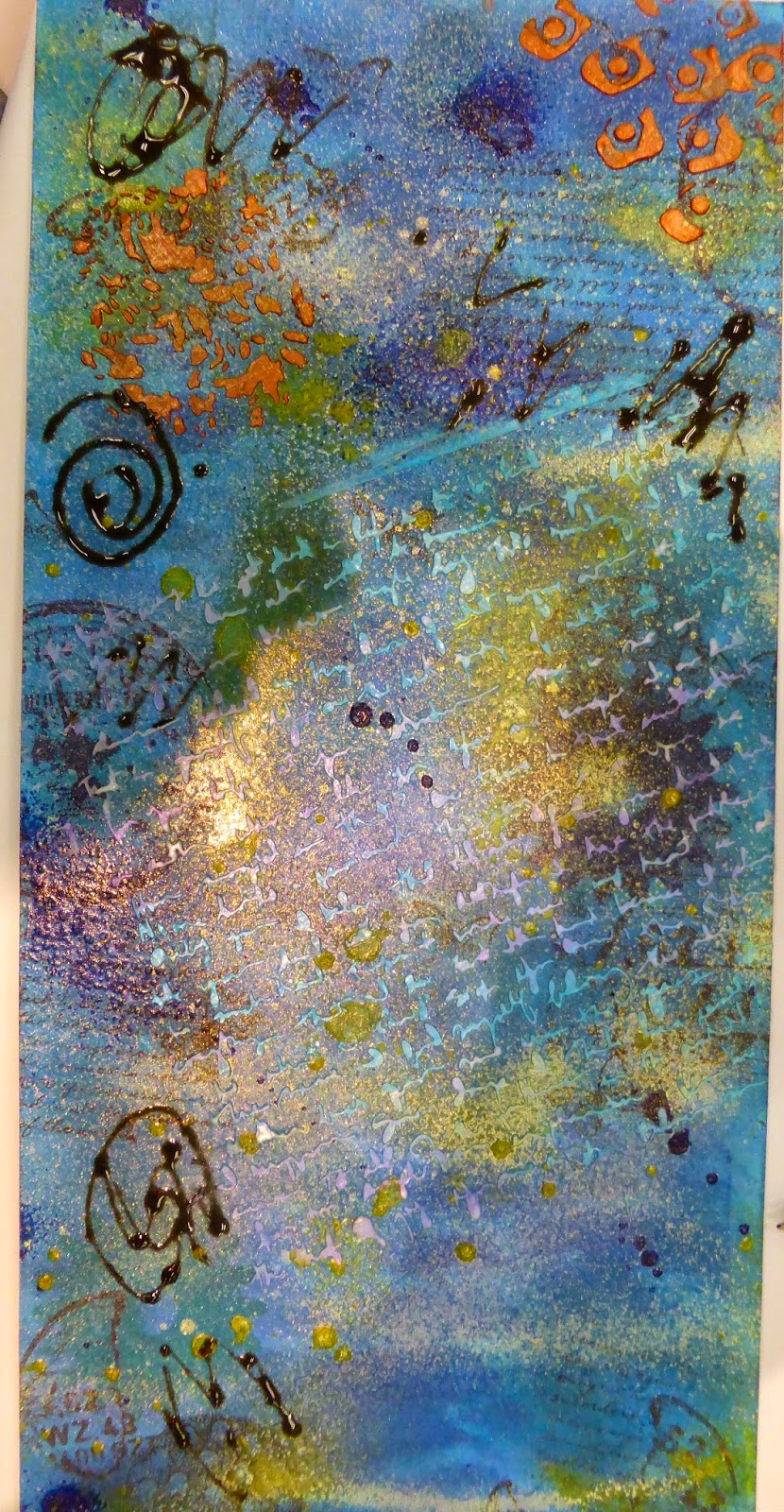
Knowing the process, here are the pics from my project . . . still a work-in-progress that I will finish when I return home.
 |
| This is the art board with the Memento Inks, Iridescent Creative Medium, irRESISTible Texture Spray, Pico Embellisher, Fireworks!, and images stamped with StazOn Midis. I had used Desert Sand, Potter's Clay and Morocco Memento Dew Drop inks as my background colors on the art board; I decided to add Bahama Blue as an accent color. I stamped the images with StazOn Midi's in Ganache, Claret and Spiced Chai. I used the Pico Embellisher in Wedding White; the irRESISTible texture spray in Danube Blue (spray) and Gold (shaking); the Creative Medium in Pink Iridescent; and the Creative Medium in Metallic Copper. |
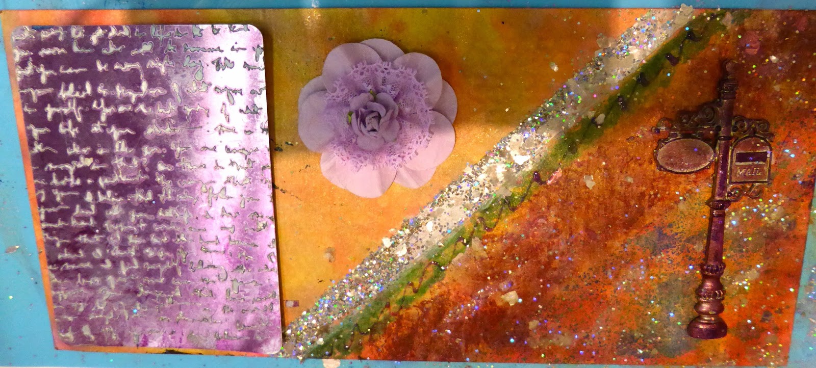
I forgot that we had the metal piece to place somewhere on the art board when I worked on the base piece. I ended up covering the upper stamped image with more of the Bahama Blue showing. I had tried to replicate that stamped image onto the metal piece but the reverse solid area within the design didn't work very well. So, I covered it up with the flowers from Prima after spraying them with Fireworks!

 |
| Close-up of one of the stenciled images with the Creative Medium in Iridescent Pink. |
 |
| Close-up to show the mica flakes, irRESISTible texture spray (sprayed in Blue Danube and shaken in Gold); Pico Embellisher in Wedding White, and stamped butterflies in Spiced Chai. |
 |
| Close up of the Creative Medium in Metallic Copper. The metal sheet base is colored with StazOn Orange Zest and St. Valentine; stamped with Ganache. |
We will schedule a demo day of these new products, as well as the other new products that I will see tomorrow at their booth. So stay tuned!
One of the hot new products at CHA are the new "do more with less" Chameleon alcohol pens, 20 in all that produce over 100 color tones. There is a mixing chamber attached to the pen that allows you to make color gradations. Cathy Andronicou, my friend from the IMAGINE Crafts' Artist-in-Residence team, has made a beautiful card using only one pen! Check this out.
 |
| by Cathy Andronicou for Chameleon Pens |
Click on this link for Cathy's video tutorial; she makes it look so easy.
Of course, I had to purchase a set when they became available in the U.S. since I had been watching Cathy promote these from the U.K. for several months now. I brought them with me since 20 pens don't take up much space.
Here's my first test of the Chameleon pens. I did not have a stamp or ink to use, so I drew a quick tangle to color with my Micron pen.

I am very surprised how quick it is to learn what to do . . . it's almost immediate. Every square has had the color applied. The more time spent putting the nib into the Mixing Chamber (top of the pen), the longer it takes to bring out the stronger color on the paper. The photo doesn't show how faint the starting color is because it looks clear to me. I'm hoping to take some pre-cut card stock with me to the show floor and see if I can get a few stamped images to use back in the room tomorrow night. Of course, I only have watercolor paper and not the blending paper specifically made for alcohol markers; luckily the Ranger Distressed Watercolor paper is pretty smooth.
If you want something dimensional for a package, a card top, a book or journal cover, or an easy way to make a mobile . . . click on to this link to learn how to make folded butterflies.
 |
| (From the Daily Fix web site) |
From the Memory Box blog, here's a beautifully "soft" colored Valentine's card. I've always loved the overlay dies that Memory Box makes and can't wait to find this particular overlay for the heart die.
 |
| by Marnie Bushmole for Memory Box |
Click on this link for Marnie's how-to:
Looking forward to returning tomorrow with photos and information from the Opening Day of the CHA MegaShow. And at Art 'n Soul, Dianne and Carolyn are looking forward to welcoming you to the first Recycled Rubber weekend of the new year!
No comments:
Post a Comment